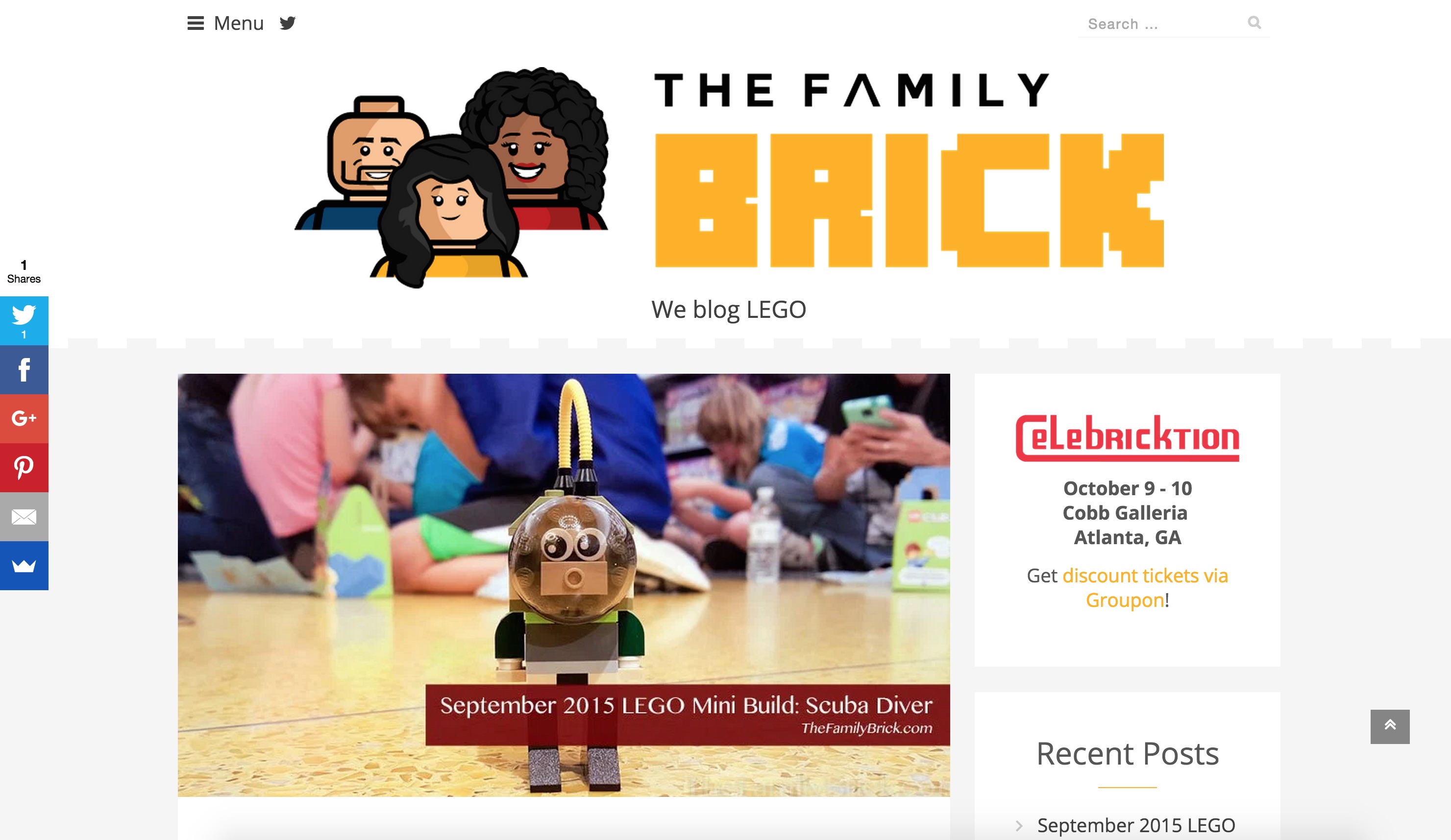
Did you notice something new around here? That's right, we have a whole new logo and look!  Since we're called The Family Brick, we thought it would be a good idea to have a logo that showed our whole family. We're short a furry friend, but we just recently added him to the fold. Maybe he'll appear in a later version of our logo.
  For our favicon (the graphic used when you bookmark our site) and our avatar around the Interwebs, we decided to use a portion of the logo. I may enlarge the white space so our faces don't get cut off, but I still think it gets the point across.
  To complete the look, we changed the design of the site. We went from dark to light with the color scheme and are using a larger font which we feel gives the site a clean and minimal look. We hope it helps bring the focus more to the LEGO articles while less to the site design itself. So, what do you think of the design? Like it? Hate it? Let us know! We promise not to be offended.


How fun — looks great!